Under The Full Bright Moon - Update 1.5 | Refreshing Start

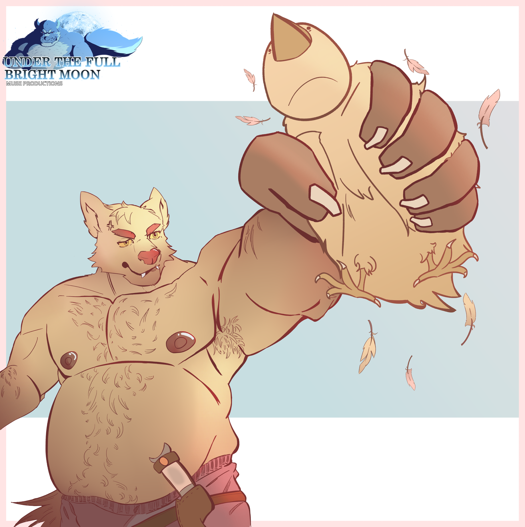
Hello, humans. I’ve finally finished the latest update for the game. There will be a development report coming from Patreon. The link is down below to learn more about some changes. This promotional art is made by DimmedL1ghts.
Link: https://www.patreon.com/posts/95633405?pr=true
Changelog 1.5:
–The story has been overhauled and extended.
–Notification will appear based on CG images, and update on Character’s bio and notes.
–The font (color and size) has been changed and fixed.
–Transition in-between has been fixed and added.
–New animations have been added.
–The History/Logs have been fixed.
–The CG section and the locked image have been updated.
–New additional CG images.
–Character Sprites has been updated with the story, but there’s one new character sprite has been added.
–An animated loading sprite has been added (by Arteomm).
–An animated text sprite has been added for the changelog only (for now…).
–Some music has been rearranged and updated.
–Some sound effect’s volumes are now improved; there are newer ones in this demo.
–Credits have been fixed and updated.
–Minor changes have been made such as the textbox and window’s transitions, adjustments on the journal section, grammar, etc…
–The mobile version has been modified for the character sprites, backgrounds, textboxes, journal section, and user interface.
–The mobile version applies the same fixes from above.
Files
Get Under The Full Bright Moon
Under The Full Bright Moon
Muse Productions Team
| Status | In development |
| Author | Muse Productions Team |
| Genre | Visual Novel |
| Tags | Bara, Fantasy, Furry |
More posts
- Our Team and The Year 2025Feb 20, 2025
- Changelog 2.5.0: Hotfix w/ Mobile UpdateFeb 03, 2025
- Changelog 2.3.1: HotfixDec 13, 2024
- Full Chapter 1 ReleaseNov 01, 2024
- An Announcement **08/31/2024**Aug 31, 2024
- An Three-Months of DevelopmentJul 24, 2024
- Under The Full Bright Moon - Update 1.5.5Mar 31, 2024
- First Demo LaunchAug 12, 2023
- Social Media and Application Setup Complete + Game ProgressionMar 11, 2023

Comments
Log in with itch.io to leave a comment.
Damn, this update is such a huge improvement compared to the first demo you released.
The main character is not an annoying brat anymore.
The relationship between Feenyx and Bowers isn't rushed like last time.
Spelling and grammar also improved alot. I didn't notice any mistakes this time. Correct grammar makes it so much easier to focus on the content. Probably because I am not a native speaker myself.
The art was already really good in the first version, but I think the characters had a lot more expressions this round. I really liked that.
Even the menu and the loading screen looked a lot more professional.
I was really disappointed with the first demo, since the art looked so nice, but I am glad i gave this project another chance. Went from a 'meh' project to one of my favorites.
Keep up with the good work.
Take your time with your hiatus. Your personal life should always come first. I will eagerly await your next update. I generally wait a few updates before deciding to support a vn, but I am already thinking of joining your patreon.
Thank you so much! 😊
Thank you for the nice comment! We could make it happen at some point later down wink wink at Kevsky. 😁
I love this update the art , It could be very interesting if in the future the MC could have a threesome romantic relationship with both Bowers and Hawke, if is possible of course
Oh God I realize now what the chicken picture is about lol
Exactly XD
Yep lol